Wednesday 27 April 2011

Evaluation Question 7


Q7.In my progression from my college magazine to my music magazine, the college magazine made me remember that producing a magazine can be very time-consuming because of the amount of different elements and conventions in the magazines that need to be taken into consideration. Time management during the making of my college magazine was an issue that I had to look at and make sure the same issue wouldn’t be repeated in the making of the music magazine. This was a disadvantage because there was no time to edit and improve what need to be improved, however if I had managed my time correctly the college magazine could have reached its potential.

The size of the fonts in my contents page in the college magazine were too big which decreased the amount of pages I was about to fit into the contents page. In the music magazine I decided to decrease the size of the fonts in my music magazine to allow more space for more page titles to be included in the contents. Also it creates more space for me to add extra features on the content page for my music magazine. I only used one photograph on my content page for the college magazine; I compared this content page to other real magazine products and noticed that there is more than just one photograph on most contents pages. Therefore, I used this idea to take more photos that I could display on my contents page in the music magazine.
The lack of pictures are another issue that came up in the college magazine, because of the lack of pictures I was not able to have a variety of pictures that may have been more suitable than some of the pictures I had to use in my college magazine.  Also the quality of pictures increases from the college magazine to the music magazine because of the different technical equipment that I could use.  I could also edit the taken pictures better on Photoshop in the music magazine than the college magazine because of the adaptation between myself and the Photoshop software. I had gotten better than the first time I had used Photoshop for a magazine and because of this, it was then easier to learn new things and use them to enhance the quality of the magazine.

The structure of the college magazine is similar to the music magazine as they both have they same conventions. Producing the college magazine made it easier to create the music magazine, as it was a reminder of the conventions that I had to include in the music magazine. It also made the conventions easier to challenge, if necessary because the college magazine conventions were used appropriately and therefore could be manipulated in the music magazine to try and create a different effect on the magazine.
For the college magazine, I did not proof print my magazine to see what it looks like as an actual magazine in ma hands, but I used this proof printing technique for the music magazine which helped me look at the magazine from a different perspective.   


Evaluation Question 6

Q6.
During the making of my music magazine I learnt that how to add special attributes to my product, through the software (Adobe Photoshop) and technical equipment such as the Canon E05 400D Camera. In using this camera, I learnt how to operate the camera for flashes and focusing the lens. I took a lot of medium close up shots for my front cover. I learnt that the camera would give me the best results when the red dots were located on the eyes of the people I was taking pictures of, otherwise the images would come out blurry. I also learnt the importance of the flash and the soft box and how they can create even lighting while taking pictures; these are good ways to enhance the quality of the image being taken.

The software I used on the computer was called Adobe Photoshop, the software allowed me to edit my photos whether they needed increasing in brightness or decreasing in contrast. This technology can help change an original photo to something that is more ideal to its given purpose and it experimenting with different tools that Photoshop had to offer, I later on found out how. There were some challenges in changing a photograph from its original being as I noticed that it doesn’t keep its natural look and looses its quality. However, if it is used carefully then the right adjustment can be made. Consequently, I learnt how to keep an original copy of a photograph on the computer as a backup, so that I still have the opportunity to start again if the edited photograph doesn’t meet my needs.
On my contents page I used a tool in Photoshop called a “lasso tool” which allowed me to create my own type of design. Using this tool was quite tricky as I did not understand its use at first, but after I had familiarized myself with it, I found it very useful because it enabled me to create a variety of different ways I could choose to structure my contents page without it looking disorganised. The lasso tool could be used by “free-hand” or by connecting lines for the desired shape. I choose used both tools to see what was more useful and efficient for what I wanted to create, and in doing this I found out that connecting lines was more efficient for me. This tool could also be edited once the desired shape was made; this could be done by right-clicking the starting point of the shape, then options will occur.

The options I focused on were the “Fills” and “Strokes”, I got to know that the fill is the colour that will go inside the shape that is made. The stroke is the colours that will act as the outline of that shape. Using the fills and strokes in Photoshop helped me to create prominence in the masthead. I learnt that using bright coloured strokes for a masthead can really help to make it stand out. Also, copying images from the internet i.e. Google could be done by saving the image from the site and then opening it up on Photoshop. Photoshop allowed me to resize and reposition the image to how I wanted. The copying technique came in handy for barcodes because it would have been a lot harder and time consuming trying to create a barcode.  I used a similar technique for my masthead; I created my masthead on a separate Photoshop file and during this I learnt that Photoshop can save the files in other types of files for example JPEG. This gave me the opportunity to drag my masthead image onto different part of my magazine as well as my masthead.

Evaluation Question 5

Q5.
First of all, I attracted my audience my using models that were around the same age range as the audience i.e. teenage models both male and female. By doing this, male and female teenagers can have something to relate to in the magazine. Enabling both sexes to feel that they can relate to the magazine can be beneficial as this will welcome a wider audience to the magazine. I also attracted my audience through the clothing of the models; Ralph Lauren and Abercrombie & Fitch are a fashion trend that teenagers are currently following. By putting these images in the magazine, it again attracts my target audience.     

On the front page of my magazine, the cover lines included names that are very well known in the hip-hop industry  
Some of the models in my magazine had different hairstyles which relate to the recent type of hairstyles teenagers have in this time. The Mohican hairstyle is a typical type of hairstyle that males have, this can attract males with similar crazy hairstyles to begin reading the magazine just because of the similarity between them and the magazine. It is common in the hip-hop industry where artists go to the extreme with hairstyles, tattoos etc


The hip-hop genre is dominated by the black culture; I followed this stereotype because hip-hop is highly recognised as genre that is performed by mostly black people. It is also known that mostly black people listen to this type of music, so I used black models to attract that majority audience. But, to get a wider audience, Caucasian models should have been included to give something that they could relate to, instead of creating a bias type of magazine. I did not focus on the body of the males and females although some hip-hop magazines attract their audience in this manner, but I wanted to focus more on the music aspect in my magazine. 

I tried to attract the audience to the magazine by making my model to look into the camera, so that it would seem as if the model is making eye contact with the reader. This creates a sense of involvement where the reader begins to feel involved and apart of the magazine. Some hip-hop magazines have their artists looking away from the camera, this connotes that the artist feels too important or has no time for cameras and therefore makes no eye contact with the camera. This is a good effect that makes the artists look more superior to the readers; ironically it makes readers pay more attention to the artist that pays no attention towards them.

I included linguistic features in my magazine to make it look more suitable for my audience. I used a mixture of both Standard English and slang in the magazine because the magazine is directed at teenage hip-hop lovers who are stereotyped for speaking slang. Slang helps to make the stereotypical teenagers feel more related to the magazine however, not all teenagers speak slang, and this is why I decided to address my audience in both Standard English and slang to make both types of teens feel related and comfortable with the magazine. Also, hip-hop is not full of formal Standard English as it contains a lot of foul language, so in order to keep that vibe of hip-hop flowing through the magazine, some slang words were needed. 

I used hyperboles in the coverlines to attract my audience. The hyperboles help to exaggerate the coverline in my magazine to create more excitement and buzz around that particle issue. “Lil Wayne Comes Back with a Vengeance”, by saying he came back with a vengeance, it makes it more interesting than to say “Lil Wayne Is Back” etc.  

Evaluation Question 4

Q4.

The audience of my media product are young teenagers that listen to the hip-hop genre. It is not gender specific as both male and female individuals appear in the magazine. However, the age range for the magazine is not intended for a wide audience, it is aimed at young teenagers. I have shown this by taking photos of young teenagers rather than having older people in the pictures; this is intentionally done to grab the attention of teens.

On the on the other hand, the older generations can still take a peek at the magazine because the artists included aren’t all teenagers, this gives something in which the adults can relate to. I have aimed my magazine at teenagers preferably between the ages of 14-20, I took into consideration that my audience are young and they most likely wouldn’t have jobs, as a consequence of this I made the price of the magazine affordable to their age range. This helps to keep the magazine within the reach of my audience as the price is held at a reasonably priced cost.

In the hip-hop industry, this genre is dominated by hip-hop artists from the USA. American teenagers would also be a part of my target audience since they are most likely to be familiar with artists from their own country. I

My audience for this media product will also be people that are interested in finding out what goes on in the hip-hop industry. My magazine contains news about the music and the artists behind their music, according to my research the majority of young teenagers wanted a magazine that mentions the hip-hop artists and their interviews. Some teenagers like to follow the fashion trend and by following my hip-hop magazine, they will be kept up to date through a variety of recent images of different hip-hop artists.

Evaluation Question 3


Harris Publishing Inc would distribute my music magazine because it increases the type of audience they will get. The type of media products they distribute are magazines based on snowmobiles, boats and golf. My media product doesn’t cause any competition; neither does it take the audiences attention away from the other types of magazines they distribute. 

This company targets a niche audience, distributing my music magazine can allow the company to gain more audiences, which will eventually lead to a bigger profit. Music is something that is very popular in the world, if Harris Publishing Inc were to distribute my magazine; it would increase the popularity of the company.   My magazine can also relate to this company as my magazine is also targeted at a niche audience, which are the hip-hop listeners.

My magazine attracts a new audience for Harris Publishing Inc, which are the younger generation. Harris Publishing Inc aims their magazines at the mature, wealthy generation, where people can afford snow-mobiles & boats etc. My magazine introduces this incorporation to the “teen” generation/audience, who keeps up with their music through reading music magazines. My magazine is not aimed at an audience with a certain amount of wealth, unlike some of the Harris magazines. This also helps Harris to gain more profit and a wider audience because most people worldwide are into music and can afford a magazine is not too far-fetched for them.

Harris Publishing Inc publishes magazines based on a way of living. “SnoWest” “Potato Grower” and “Sugar Producer” are magazines which represent that type of lifestyle genre. Having a different type of magazine with a different genre can broaden the horizon for Harris Inc. My magazine would be a great way to gain a new audience because of its difference & uniqueness in the company, since it has never been done before in the company it may become appealing to the audience.

My magazine can be distributed in a number of ways through this company. It can be made purchasable at shops and local newsagents across the nation. Shops and local newsagents are ideal places for the target audience to get the magazine, as it is not a difficult process for the readers to obtain the product. Another way of distributing my magazine is by creating newsstands near schools and colleges, by going right to the source of my target audience, it makes it a lot easier for them to purchase or acknowledge.

In order for my magazine to reach a high popularity, it should be advertised online where a lot of the younger generation spend their leisure time. This would be convenient for Harris Publishing Inc as they already have a website, they can advertise the magazine online too. Since Harris Publishing Inc is already online, sites like Facebook, MySpace etc. can be used as a way to advertise the magazine more to my target audience. This can benefit the company because it does not cause the company to loose money in any way, as it is a free process. I believe by taking these minor steps, a positively major effect can be created.

Evaluation Question 2

Q2. 
My music magazine gives the typical hip-hop look as it is contains mostly males in the magazine. Although my magazine has a lot of males in it, I included a female to avoid the male dominance.
This was done to encourage the female hip-hop lovers to let them know that the magazine is not only for men. In hip-hop magazines, there are usually a group of male rappers posing in the photographs. I imitated this convention to keep to the hip-hop theme of magazines:  

The stereotypical view of hip-hop magazines are that they are full of angry artists, I prevented this look by using smiling models to add a different kind of theme to my magazine, but at the same time keeping it in the hip-hop category by displaying different poses that typical hip-hop artists make.

The hip-hop costumes usually show expense and brands to show that the artists make the money. They use props such as jewellery, brands and sometimes refreshments (expensive wine). In some of the photos I took. Ralph Lauren, Abercrombie & Fitch and some jewellery were used to represent this kind of hip-hop wealth in the magazine. Brands like Ralph Lauren and Abercrombie & Fitch are good brands for my magazine because they are the type of clothing that teenagers can easily recognise. 


This magazine is directed towards teenagers, this is why I used teenage models for my magazine. It helps the readers to relate with the magazine a lot easier because seeing people around their age group helps to create a comfort zone for the reader.

In this magazine I have included topics which my target audience can relate to. The obvious or most stereotyped topics that teenagers seem to have are on relationships, because of this I had included this issue in my magazine. I represented this social group with a male and female in a photograph close together, automatically teenagers will already begin to think that they are a couple because of that stereotypical nature teenagers have of believing that every male or female that are close to each other go out. I used this stereotype to my advantage to help represent these two models as a couple.


Tuesday 26 April 2011

Evaluation Question 1

Q1.
My media product used many conventions of a real media magazine. On my magazine the masthead was positioned in the same position as a masthead in a real magazine, I did not challenge this convention because of the “left-third”. Leaving the masthead there allows the magazine to be easily recognised by a customer in the store as magazines are usually overlapped except the left third of the magazine.

My main cover line is another convention of magazines that I used, which gives a little bit of information about the main image on the front cover of the magazine. Main cover lines are usually the largest and noticeable features on a magazine, besides the masthead. I used this convention to get the attention of the audience, to aid them with more knowledge of the model on the front cover. Main cover lines are recognised by the huge characters, different colour font and the change in font between everything else on the front cover. 
Main cover lines are also followed by kickers; I added this convention to my magazine to let the audience in on the story of the main image.  Kickers are positioned around the main cover line so that it is obvious that the kicker is related to the main cover line. I chose not to develop this convention, because placing the kicker anywhere else may have inappropriate.


One of the conventions I developed was the dateline. Instead of putting the date next to the barcode, I thought that placing the date around the main cover line would be a better idea because it allows my audience to realise that it is a monthly issue, also it is a lot easier to tell what issue is being read as it is adjacent to another convention that grabs the attention of the reader.

I also used a barcode for my magazine. This convention is useful in letting the audience know that the magazine comes with a price. I chose to put the price of the magazine on top of the barcode because they are related conventions. Real magazine products put their prices on the inside of the barcode, but I preferred to put the price on the top of the barcode to make it more noticeable.   


On real media products, the photographs used on the front page of the magazine are usually taken with only one person. Also, there is generally only one image on the front page of the magazine, they mostly consist of a mid-shot photograph of a person posing. In hip-hop magazines, the music artists mostly look directly into the camera with a stern expression, giving that illusion that they are looking at the audience. This effect helps to give the impression that the music artists are serious people and in some sense, demand their respects.


 I challenged this convention through the facial expressions I wanted my models to make. I decided not to add “stern impression”. By making the model in the magazine have an expression with a lot less seriousness, assisted in giving my magazine a little more enlightenment and sociability.
The colour scheme is another convention that I used on my magazine, the colour scheme of red, yellow and white stayed consistent all through the magazine. This convention helps to keep the magazine pleasing to the eye and organised. Another convention I followed was the structure of “XXL Magazine”, where the cover lines are positioned around the main image; I used this convention because I thought it would be a convenient way to get the audience to focus on the main image. Also, the magazine’s structure looks more appealing as well as it being organised.


Photoshop Tutorial Used For Creating Masthead


The video above helped me in creating my masthead. The pulse lines were needed in order to create the effect of a heart beating. Using this tutorial, allowed me to create the masthead below.


Monday 28 March 2011

Publishing House Case Study


Harris Publishing Incorporation is a publishing company that includes a variety of 15 niche publications and 5 specialty events in those areas.

Harris Publishing is well known and valued in these industries for its writing, photography and design.  Harris Publishing began in 1971, and launched three magazines: “SnoWest” “Potato Grower” and “Sugar Producer”. Through the years, other publications in boating, golf, trucks, lifestyle, snowmobiling, and industry publications were added.

In publishing these niche titles it was obvious there was a need for related events. Harris Publishing Inc aims their magazines at people that take an interest in boats, snowmobiles and golf. Thus, Harris Publishing filled these needs in the boating, snowmobiling, and golf areas and started the National Houseboat Expo, On the Water Expo, Intermountain Snowmobile Show, Idaho Snowmobile Show, and the Mountain West Golf Expo.

In keeping with their tradition of setting the velocity in the market they have partnered with the leading digital and print fulfilment company.

Harris Publishing, Inc also owns Falls Printing, LLC. This company is located in Idaho Falls, it is known as a leader in the printing industry ever since 1953. This company prints business cards, magazines etc.
Harris Publishing may target different audiences to broaden the amount of readers they can get. By doing this, the more readers they achieve the more profit they receive. However, if they only targeted one type of audience, it would be likely that they would achieve a less audience.

Wednesday 23 March 2011

Feedback:

Gabriel-  your magazine looks really good, well done! and your blog is looking really nice and tidy-  not sure about the template you've used though-  its a bit narrow-  can you change it so that the centre section where your blog posts are is wider, as it is difficult to judge how much you have written in each post.

Sunday 20 February 2011

Music Mag Draft : FrontPage


This is a draft of my music magazine that i will create later on. the color scheme of the page will be red, black, white & yellow. The masthead will be kept in it ideal place, which is the left third of the front page. The selling line will be at the top of the magazine on top of a highlighted background to make it stand out. The cover lines will be aligned at both sides of the page, but the main cover line will be positioned across the chest of the artist in the main image. The main cover line will in red and black colors, outlined with a white stroke around it. The dateline will be placed on top of the main cover line but will be left in white font but will have an outer, dissolving glow of maybe white or red. Underneath the main cover line At the bottom right hand corner will be the position of the bar code and above that will be the price of the magazine. At the bottom of the magazine is the name of the website for the magazine, this will be in yellow or white colors so that it can still be spotted by readers.

Saturday 19 February 2011

Music Mag Draft: Contents


This is my draft for my contents page. A smaller version masthead appears again in the left-hand corner of the page slightly tilted. The title of the page "Contents" will be placed at the top right-hand side and adjacent to it will be the dateline. The background behind the title and the dateline will be dark red or black. The blank space below will be left blank so that the content will be easy to read. The content of the magazine will be categorized into 3 different parts; features, specials and extras. The extras will be positioned at the bottom right-hand corner of the page. I will add three photographs to the content page to give a sneak-peak to the rest of the magazine. a reminder of the selling-line will be shown at the bottom left-hand corner of the page.   .    
  

Monday 7 February 2011

My Photography Equipment


Canon EOS 40D Camera
10.1 megapixel APS-C CMOS sensor
DIGIC III processor
3.0 inch LCD Monitor
14-bit Processor
Live View Mode
Wide 9 point AF (all points are cross-type with the centre point having an additional f/2.8 sensitive cross-type sensor placed diagonally)
Selectable AF and metering modes
Built in Flash
EOS Integrated Cleaning System
ISO 100-1600 (3200 with custom function)
Continuous Drive up to 6.5frame/s (75 images (JPEG), 17 images (RAW))
Canon EF/EF-S Lenses
Canon EX Speedlites
PAL/NTSC video output
File Formats include: JPEG, RAW, sRAW (both RAW formats are 14-bit)
RAW & JPEG simultaneous recording
USB 2.0 computer interface
BP-511/BP-511A or BP-512/BP-514 Battery Types (BP-511A battery supplied)
Approx Weight 0.740 kg


Bowens Gemini Esprit Flash


Max Power 500Ws
Guide No. (m/100 ISO) 85
Recycle Time to full power 1.3 Secs
Flash Duration to t=0.5 1/900 Sec
Flash Power Range 5 stops
Flash Power Variation 15Ws - 500Ws
Power control Stop & Tenth Dials
Replaceable Flash Tube BW2032 UV
BW2030 Clear
Modelling Lamp 250W Halostar
Model Lamp Variability


Full
Proportional
User Defined
Off
Colour Temperature 5600K ±300K
Voltage Stabilization ±0.5%
Lamp Saver Yes
Auto Dump Yes
Flash Inhibit Circuit Yes
Ready Light Indication @100% charge
Audible Recharge Confirmation Yes
Reflector Mount 'S'-Type
Operating Voltage 190-250V 60Hz
Sync Voltage 5V
Built-in Slave Cell Yes
Switchable Slave Cell Yes
Circuit Protection Yes 5A(F) Fuse
EM Noise Suppression Yes
Plug-in radio trigger Optional
Travelpak Compatible Yes
Width 170mm
Length 380mm
Height 133mm
Weight 3.4kg

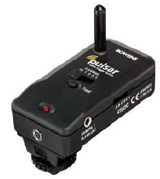
Bowens Radio Trigger

This multifunctional device can be used to trigger flash units, film and digital cameras and light meters up to 100m. Because it uses radio transmission, rather than IR, it allows for triggering around corners, through walls and is not affected by high ambient light situations.

60cm Soft Box

60cm Softbox with white interior is the perfect solution for obtaining soft, diffused lighting. Its rigid body construction and colour-tested removable diffusion panel provide quality results. Rods are constructed from a high carbon stainless steel. The rounded fitted collar is made of heat resistant material and minimizes light loss. The white interior allows for a high light output but slightly softer than the silver version and the removable interior baffle allows for extra control and flexibility. Adapter Ring sold separately. For use with lights up to 1000w.

Type: Softbox
Use with: Most flash heads via Adapter Rings
Weight: 900g

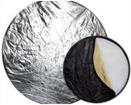
Circular Reflector


Sunday 30 January 2011

Textual Analysis For Music Magazine Contents Page


This is a contents page created by a music magazine “Vibe”, the main image of the content page is a celebrity by the name of “Amber Rose”, who is known through affiliating with another famous celebrity, “Kanye West”, who is a well-known artist in the hip-hop industry. By taking genre-related pictures, this should help me attract the correct type of target audience I desire. The “Vibe magazine contents page has started off with a low key lighting image with a spotlight going over her face, this may have been done to enhance the awareness of the famous celeb.  Also, the rest of the image is darker, which makes it easier to recognise the famous celeb. The costume that Amber Rose is wearing connotes wealth, as the fur coat and necklace/medallion she is wearing represents a lot of money since they must have cost a lot to purchase.

The top left corner had the magazine logo placed there, along with the website name for the magazine. The layout of the magazine makes viewers focus more on the celebrity, rather than the actual contents. The contents are in small san-serif fonts and take up about 1/3 of the entire page, which are aligned on the left-hand side of the page in white font. The first heading on the page reads “Departments”, which declares the other sections in the magazine, which are listed underneath it. The “Departments” heading is in a larger bold, white font compared to the rest of the page, this shows its purpose as the heading for the rest of the context below.
  
The purpose of this layout is to capture the audience’s attention with the image of a famous celebrity (Amber Rose). The light font on a dark background has made the reader’s job easier, as the font can be read clearly. The small images next to the sub-headings are colour-coordinated with the page numbers, this colour scheme helps to add some sort of colour to the dull image. This magazine has approximately 120 pages in this issue. Underneath the sub-headings is information about the page with the names of celebrities that are very famous, strangely enough the fonts are not in a bold font, which makes this hard for the readers to notice the full content of the magazine.

In conclusion, the content page can be improved by creating actual awareness of the content by increasing the size of the content information or having the text bold. The layout of the magazine is very efficient for attracting reader’s attention to the image. The image of Amber Rose helps me to widen the variety of the type of people that I can put on a music magazine, where it’s not just the artists, but some people who are affiliated with the music artists of that genre i.e. hip-hop. Also it was noticeable that there was only one picture on the content page, an increase of images of different music artists and associated can also be advised for improvement.

Saturday 8 January 2011

Music Magazine Conversations


Conversation 1
12:06am
do you read music mags?

12:06am
yh...

12:07
 What makes you pick up a magazine?

12:08
erm.. I guess the pics on the front page

12:11am
.. Would you want related or unrelated ads ?

12:11am
Related 

12:12am
Would you like to know about the new artists or old hip-hop artists? ..Or both 

12:12am
Both

12:13am
would you like the magazine to have a dark heavy theme or a lighter kind of theme?

12:14am
Light...white background with various artists on it and the title in front of them

12:14am
Alright so, would you prefer to hear more about the lifestyle or music of the music artists?

12:16am
Music of the artist...i don’t care about their lifestyle... I don’t want to live like them  

12:16am
Okay, but would you still want to hear about their interviews?

12:20am
yh 

12:20am
How about free things from the magazine?

12:20am
Yeah!!

12:21am
What kind of free stuff would you want?

12:23am
yhhh a picture of music artists

Conversation 2

12:08am
Hey!

12:08am
Gabs!

12:08am
Let me ask you something… do you read magazines?

12:09am
Not much... 

12:09am
You see for music magazines yeah... what attracts your attention to them?

12:20am
It’s the pictures that I look at. 

12:21am
Kk

12:22am
As a reader would you like related or unrelated adverts to the magazine?

12:24am
Related
Its more appealing and makes more sense to people of my race and age group

12:25am
Kk... Would you like to know about new or old artists.. Or both? 

12:27am
Both
But not that gossip nonsense

12:28am
Cool...  would you like the mag to be dark/heavy themed or lighter?

12:29am
Lighter

12:31am
Would you like to know more about some artist’s lifestyle or the music 

12:34am
Both really, majority of music is about the lifestyle

12:37am
Would you want to hear about interviews too ?

12:38am
Yeah.. Especially the ones were the artist really open up to the public

12:39am
oh right ..
 Would you want freebies from the mag?

12:50am
Umm depends

12:50am
On?

12:50am
What the free stuff is

12:51am
What would you like it to be?

12:51am
lip gloss
Headphones

12:57am
good
thanks

Conversation 3
1:12am
Remi ! do you read magazines?

1:13am
Yeah 

1:14am
:D
 what attracts you to a magazine?

1:14am
 The words and images they have 

1:15am
Cool...
Would you prefer image... Text or both?

1:15am
Both

1:20am
Would you like the magazine to contain related to unrelated adverts?

1:21am
A bit of both
Any more

1:23am
do you want to know about new artists , old 1z or both ?

1:25am
Both

1:26am
type of theme for the magazine: .. dark/ heavy .. or light ?

1:29am
Bit of both depends what the article is about

1:29am
would you like to know more about the music that they make or the lifestyles they live ?

1:31am
Both

1:33am
Want to know bout interviews?

1:33am
Yeah

1:34am
Do you want freebies from magazines? If yes what?

1:34am
Yes
Vouchers, music, posters stuff like that

Conversation 4

1:28pm
Anna i got sum questions 4 you 

1:29pm
go on

1:31pm
do you read magazines?

1:34pm
i don’t usually read magazines

1:36pm
Okay but what would interest you into reading a magazine?

1:42pm
What would attract me to a magazine would be colors and pictures

1:43pm
Would you like mostly pictures, text .. or both evenly?

1:44pm
Both

1:45pm
Would you like related adverts to the magazine or unrelated adverts?

1:46pm
Ermm i wouldn’t mind but i think i would like unrelated

1:47pm
Would you want to know bout old artists new... or both?

1:47pm
Both

1:49pm
Theme of the mag: dark/ heavy.. or light?

1:50pm
Dark/heavy

1:51pm
Want to know more about the lifestyle or actual music of the artists?

1:54pm
A combination of both

1:55pm
Want to hear about interviews?

1:55pm
Yeahh

1:55pm
Want freebies?

1:56pm
Yeah

1:56pm
Like what?

2:00pm
Ermmm like discount codes

2:00pm
Nice to know .. thanks

Conversation 5

12:53pm
do you read magazines??

12:54pm
sometimes 

12:55pm
ok.. What attracts you 2 a music magazine?

12:56pm
I like music, so it depends on the type of music it has.. and the images. So basically the content and images really ..

12:56pm
..  so what would you like to see more of? Text... Images or both

12:57pm
images are better

12:57pm
okay, but for adverts on the magazine... Would you prefer them to be related or unrelated to the magazine content?

12:58pm
related, what’s the point for irrelevant stuff..
 
1:00pm
Fair enough, so who would you to know about more? New artists... old artists or both 

1:01pm
some info bout ermm ... the new upcoming artists really.. no old artists! 

1:02pm
What about the theme for the mag.. dark & heavy or something abit lighter..

1:03pm
I say both so I don’t get too boring..

1:04pm
That’s true.. so what about the artists themselves? .. do you want to hear mostly about their music or their lifestyles?

1:05pm
their lifestyles because its kind of interesting finding out about the own interests and stuff like that.

1:06pm
So would you want interviews to be included in the mag then?

1:06pm
Obviously!

1:07pm
Okay then ! would you like free things with the magazine ? and what would you want if you did ??

1:08pm
Free stuff would be great though … I’d probably want posters with music artists on them